I LOVE TYPOGRAPHY
Upon studying typefaces and letterforms in my second year of college I started enjoying exploring typefaces and letterforms in my projects. I created a few custom letterforms too.
However, soon I realized that while working on any project that needed me to find a suitable font for the mood, it would be very frustrating for me to quickly find that perfect typeface. This happened because most websites do not use mood as the primary search criteria for typefaces. This project is an attempt to do that
The website uses moods and emotions as the primary search filters to find typefaces. The narrative for the website makes use of negative space and plays on the word 'type' itself.

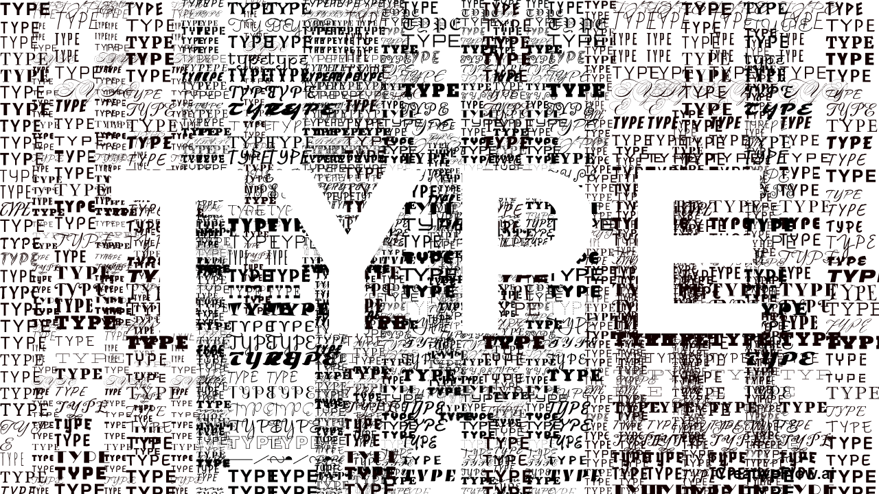
This part shows the landing page which displays the word 'type' using negative space formed by a clutter of a plethora of fonts and directs the user to a search box, indicating a mood based search.

This is the section that shows a selection of fonts after the search has been done. It follows a simple layout and has added filters for segregation, the website font is a scribble as it establishes a good contrast.

Each page after the first search has a simple element and color that represents the mood. Upon hover the font can be seen before a black and a white background to fully understand its properties.

The filters are inspired by Adobe Fonts, however the meaning of each type based term is given close to the filters itself along with a hover drop down so the one does not feel the need to google what x-height means.